The Pantone Color of the Year for 2022 is set to take over: Get ready to see more Very Peri everywhere!
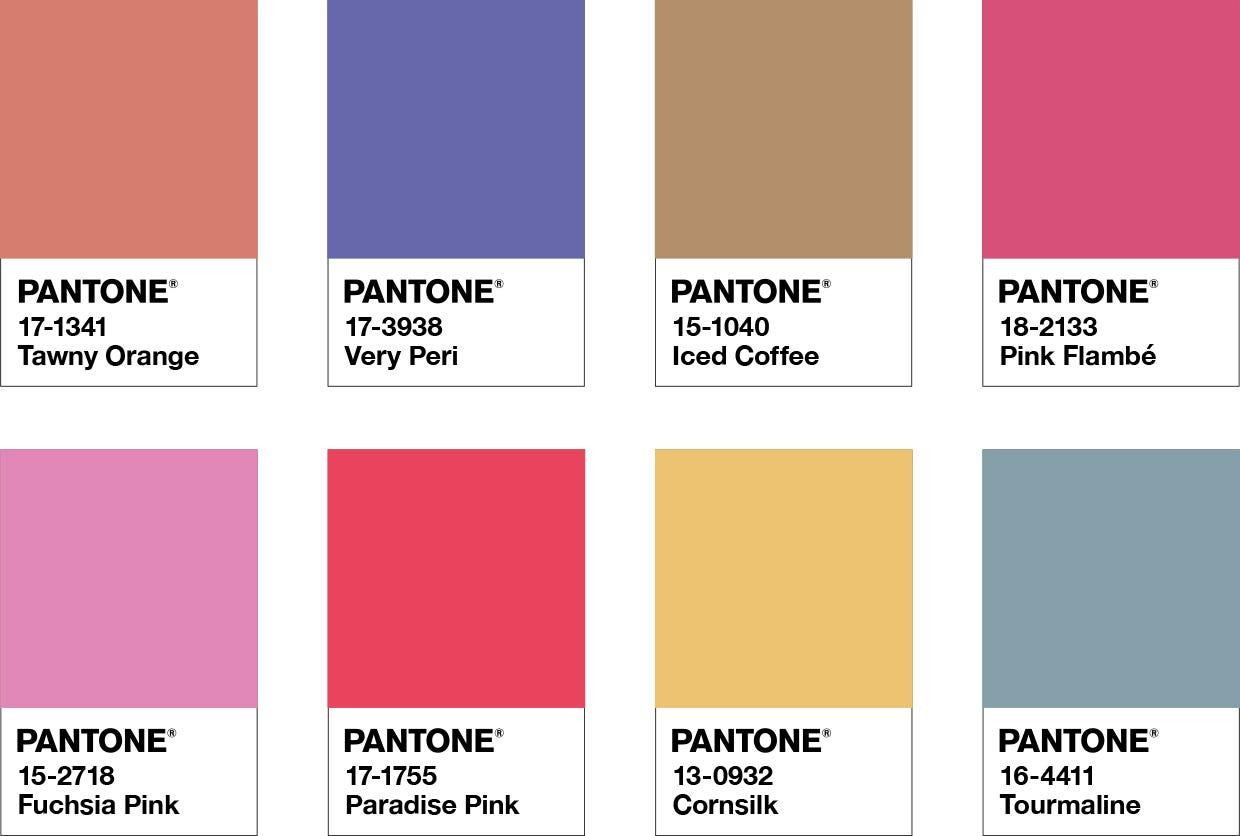
PANTONE 17-3938 Very Peri, the Pantone Color of the Year for 2022
Pantone describes Very Peri as having the qualities of the blues with violet-red undertones, displaying a “spritely, joyous attitude and dynamic presence that encourages courageous creativity and imaginative expression”.
For years, Pantone’s Color of the Year has influenced fashion, home furnishings, industrial design, product packaging, graphic design, and more. This year, they’ve taken it a step further and created a brand new color for the first time in its 22-year history: Very Peri. In this blog, we’ll take you through some creative ways you can incorporate Very Peri into your kitchen. If you’re planning a remodel this year, you’ll find some fresh ideas to inspire you here!
Understanding the Very Peri spirit: Why is it Pantone’s color for 2022?
This color was created to represent the hope and possibilities people are looking for in today’s climate, globally. Laurie Pressman, Vice President of the Pantone Color Institute, explains:
“The Pantone Color of the Year reflects what is taking place in our global culture, expressing what people are looking for that color can hope to answer… Creating a new color for the first time in the history of our Pantone Color of the Year educational color program reflects the global innovation and transformation taking place. As society continues to recognize color as a critical form of communication, and a way to express and affect ideas and emotions and engage and connect, the complexity of this new red violet infused blue hue highlights the expansive possibilities that lay before us.” Could Very Peri be just the burst of optimism we all need? Take a look at some creative ways to incorporate it into your kitchen this year, and let us know what you think!
How to use Pantone’s Color of the Year in 2022
Whether you’re looking for something subtle or are leaning toward a more eclectic style, there are interesting ways to add exciting colors like Very Peri to your kitchen design. Before you begin, think of your color palette, and see if Very Peri is a good fit.
Adding Very Peri to your kitchen’s color palette
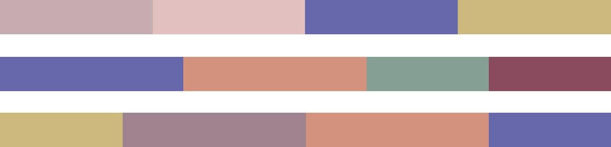
Start by thinking about your color palette. Pantone has created four unique color palettes featuring PANTONE 17-3938 Very Peri to inspire you as well as to demonstrate just how versatile this color is. We’ve included these four color palettes by Pantone in this blog to help you get started, and we’re sure, with the help of a designer who understands your goals, you can explore many more possibilities.
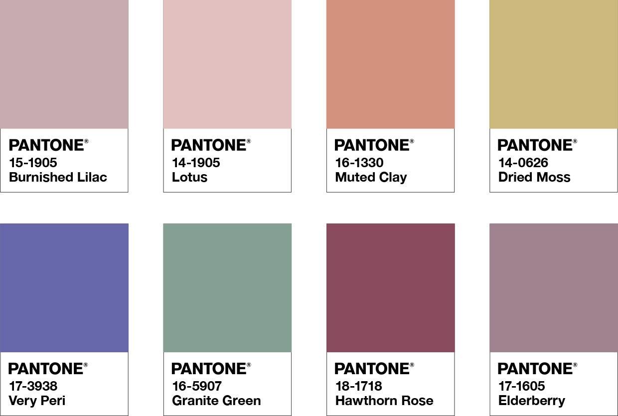
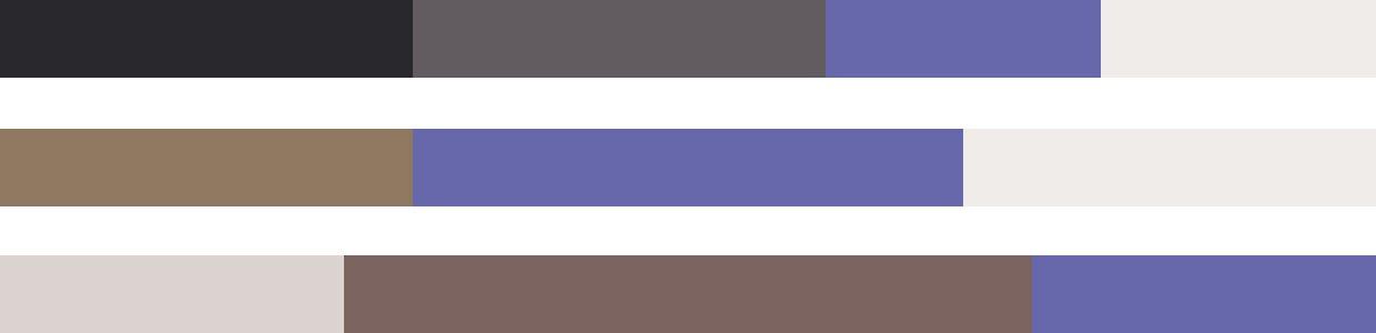
A) BALANCING ACT:
In this palette by Pantone, warm and cool tones complement each other. Very Peri pairs beautifully with each of the other colors. On the whole, we find this palette vibrant yet relaxed.
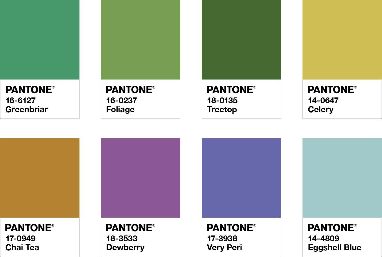
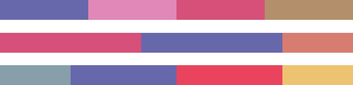
B) WELLSPRING
If you love greens, you’ll love how Very Peri intensifies their brilliance in this soothing palette. Being in nature, eating nourishing foods, and watching a garden bloom are a few lovely experiences that this palette brings to our minds.
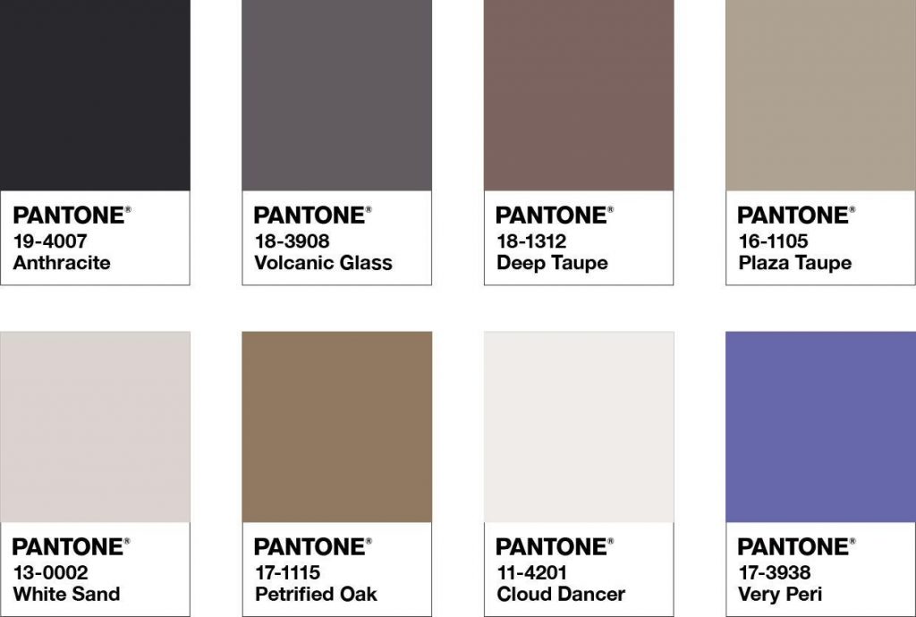
C) THE STAR OF THE SHOW
While Very Peri may not feel like a natural fit among browns and greys, this palette demonstrates that it can be a refreshing presence amidst neutral colors. The classic colors create sophistication and elegance, while subtly nudging Very Peri into the spotlight.
D) AMUSEMENTS
In this bright, joyous, whimsical palette, Very Peri finds colors that can keep up with it. Just like the 2022 color of the year, the other colors in this palette are playful and expressive—perfect to create a space that inspires spontaneity!
We love how these palettes by Pantone demonstrate the versatility of Very Peri, showing that it’s possible (and, if you ask us, encouraged!) to choose combinations that reflect your personality. When you consult a kitchen designer, remember to prioritize your individual taste over the trends, because the goal is to create a space that you feel at home in.
As mentioned in our blog on 2022 kitchen design, greens and blues are growing in popularity. So, Pantone’s 2022 color Very Peri would make a great accent color this year.
Read: Sleek, Bold, Efficient: 2022 Kitchen Design Trends to Watch
Once you have a palette in place, you can start thinking of specific places where Very Peri would look good.
5 ideas for bringing Very Peri into your new kitchen
Very Peri is not a neutral color that will blend into the background. It has a strong presence. Depending on your affinity for this color, you could add it to your kitchen in bold or subtle ways.
Keep in mind that trends are a fantastic source of inspiration, but that’s all they should be. Take your final design decisions with: a) A deep understanding of yourself and your preferences, which a good designer will help you zero in on b) A long-term view, considering how long you will love the design for, as well as its impact on resale value
So, we recommend using the following ideas to spark creativity and exploration during the kitchen design process, to see if you find something that genuinely appeals to you and your family. Note: The images in this blog show colors that match or are close to Very Peri—such as periwinkle—to help you visualize what it would look like in your kitchen.
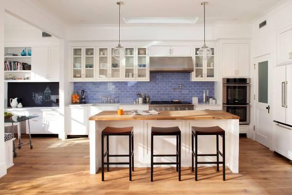
1. Use Very Peri tiles for your floor or backsplash
Pantone’s color of the year, Very Peri, is a cheerful and energizing shade. You can use it selectively to brighten up your kitchen. Need to replace some old floor tiles? Consider geometric patterns in Very Peri. Want a backsplash that makes a statement in your all-white kitchen? Very Peri could be just the color for you!
Backsplash with periwinkle subway tiles, as seen on designtrends.com
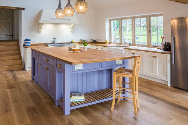
2. Liven up your cabinetry with Very Peri
This could work especially well if you opt for two-toned cabinetry. For example, you could have white wall cabinetry with a Very Peri island.
Kitchen island with painted cabinetry in periwinkle. Image: Houzz.
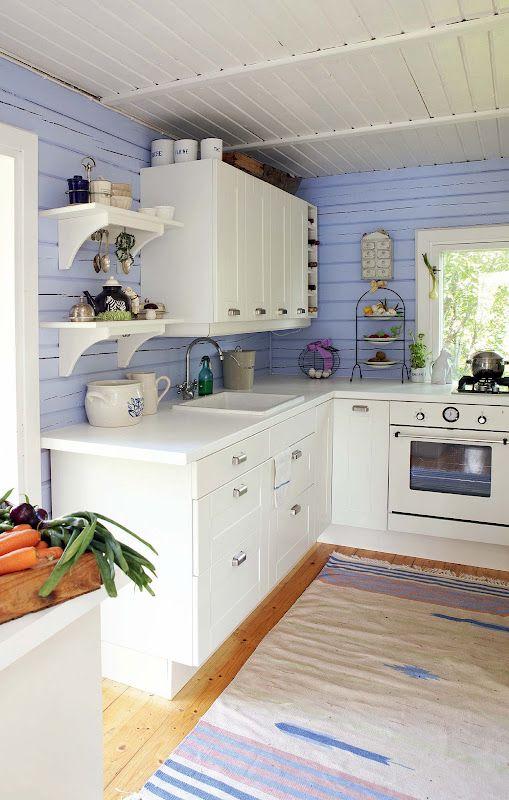
3. Paint your wall(s) Very Peri
Either an accent wall or all the walls of your kitchen can look beautiful in Very Peri, with the right cabinetry, floors, and ceiling. In the image below, Very Peri walls brighten the whites of the ceiling, cabinetry, and stove, creating a calm and cheerful look.
Periwinkle walls in a coastal-style kitchen, as seen on Pinterest.
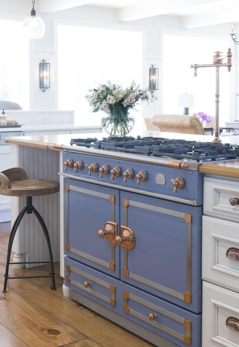
4. Turn one of your big appliances into a talking point with Very Peri
Periwinkle or Very Peri looks great in a kitchen with white cabinetry and stainless-steel appliances. But if you want to do something unique with this color, think of the appliances themselves. Pictured below is a stunning range paired with cabinetry by Dura Supreme—a top-rated cabinetry manufacturer we work with—to create a truly impressive kitchen design.
Dura Supreme cabinets with the St. Augustine door style paired with a Provence Blue La Cornué 5-burner range. Full story here.
5. Very Peri countertops
They’re unconventional, but that could be what makes them the right choice for you! Very Peri, i.e., Periwinkle countertops may work well in certain kitchens, such as the white and blue kitchen pictured below.
A few notes on balancing color in your kitchen
Color can transform a space and make it feel larger or smaller, homier or formal, quirky or sophisticated, etc. Aside from the color choice, these effects also come from the way colors and textures are balanced. So how can you create balance using Pantone’s Very Peri? Here are a few easy ideas from us:
1. Bring in more greens: These greens can come from plants, trees outside your windows, accent walls, soft furnishings, and even light fixtures, in line with the Wellspring Palette above
2. Contrast it with clean whites: White dishes, walls, furniture, and cabinetry look crisp and bright against Very Peri
3. Pair it with wood finishes: Wood floors, countertops, cabinetry, and furniture look rich, deep, and warm in a room with Very Peri
Very Peri is just one idea—you can apply the same approach to playing up another color in your kitchen as well. But keep in mind that color can be especially tricky in a kitchen because, as a high-traffic room, it needs to be versatile enough to work for various situations, especially if you have an open plan. In addition, it makes sense for the kitchen’s style to tie in with the overall style of the rest of the house. That’s why choosing colors for your kitchen needs considerable thought, ideally with guidance from an experienced professional.
We always recommend thinking about your personal preferences before the design process begins, to develop a clear idea of what you like. That way, your design/remodel team can create something super-customized and perfect for you.