Cooking is love made visible. – Anonymous
How the B+K team reimagined Kristen & Tim’s 1960s kitchen with Dura Supreme Cabinetry (Bria), construction work included | $84,481.82
Spending time in the kitchen is a large part of people’s lives. Whether you’re the family chef or connoisseur, we’re sure you have a special connection to your kitchen. As Bath+Kitchen designer Kat Reynolds says, “it’s truly an honor and a privilege to be invited into someone’s home to help customize this space for their family.”
One couple Kat worked with recently is Kristen Cooper and Tim Pollock. Their home was built in 1961. For people who love to cook, that detail alone suggests the need for a big change—keep reading to learn why!
Saying goodbye to their 60s “eat-in” kitchen
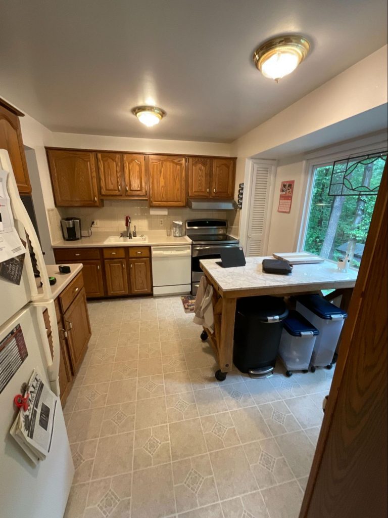
When a kitchen is built has a big impact on its layout, design, and functionality. While they undoubtedly reflect personal preferences, kitchens also reflect what was going on in terms of culture, trends, and technology at the time when they were designed. Kristen and Tim’s kitchen (pictured left) was built in the 1960s—a time when convenience foods were picking up steam. This was the era of homebuilding in which microwaves were first being introduced as a part of the ‘Modern’ kitchen.
As the market for frozen foods and pre-cooked meals grew, the need for pantry and storage space shrank. But in recent years, more people have been cutting back on convenience foods and reconnecting with cooking, as a way to nurture both healthier habits and culinary creativity. So, although it was great for the 1960s, Kristen found her small two-wall “eat-in” kitchen too restrictive. That’s where we came in.
Making room for quality time and fresh-baked treats
One of our top goals for the new design was creating a space that would serve a homeowner in 2021 better. Through our well-honed process, we did a deep dive into how Kristen and Tim truly wanted their kitchen to look, feel, and function.
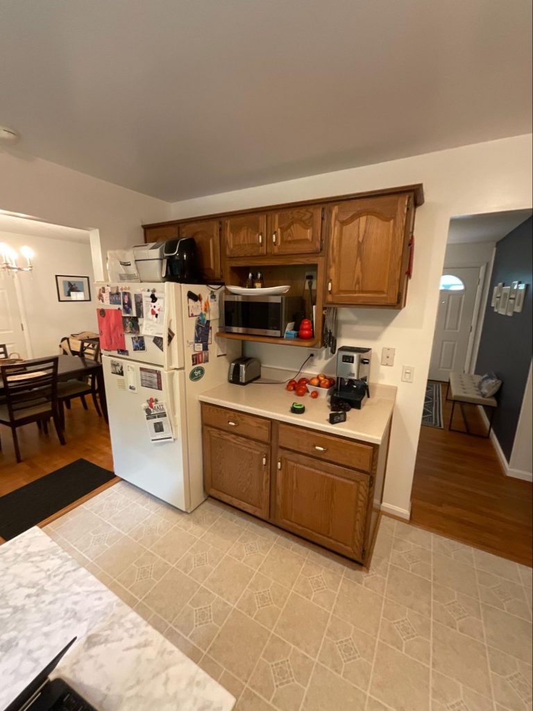
- Better for baking: One of the first things we learned was that Kristen loves to bake. However, because the kitchen wasn’t designed for a lot of cooking from scratch, she didn’t have enough storage for her small appliances, spices, and baking items. The working surface for prepping food was much smaller than she wanted. Additionally, there wasn’t a good place for her to keep her cherished cookbooks, stemware, or wine storage.
- Stocked for Echo: Kristen and Tim have another family member to think of—Echo, the family dog. Because Echo is a large dog with a large appetite, planning where to store dog food was an important detail.
- Optimized for storage: The existing dinette was situated in front of a lovely large picture window overlooking the backyard. The picture window took up most of the space along one wall. There were two narrow pantry closets on each side of the picture window. One pantry closet even covered a bump out reminiscent of an old chimney!
Our design: Reimagining Kristen & Tim’s kitchen
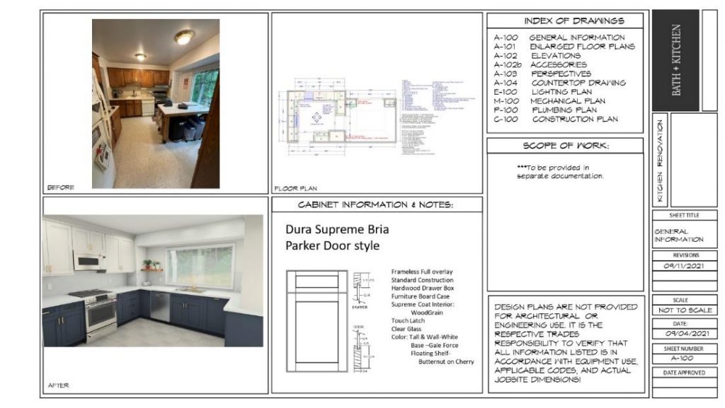
Before, after, and the designs in-between
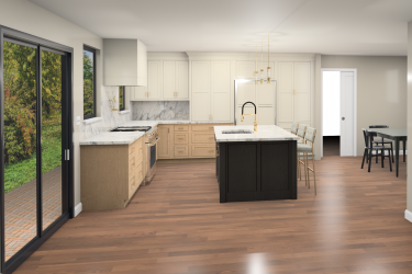
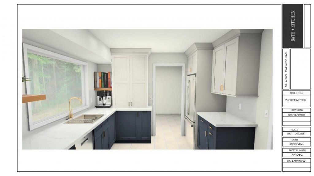
Our solution to the inadequate cabinetry storage challenge was to eliminate the two small pantries, shorten the picture window, and allow the sink cabinet to be centered under it. Not only did this allow us to retain the lovely view, but it also helped us gain a full wall length of storage as well as some additional cabinetry.
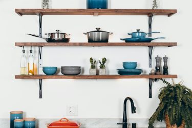
To the right of the window, along the adjacent wall shared with the formal dining room, we added some open shelves for her cookbooks. We also added in this location a spacious baking cabinet from Dura Supreme, which had spice drawers, as well as a roll-out shelf for her mixer.
For the solution to her dog food dilemma, we added a pull-out bin for dog food with an added drawer above for doggie treats.
For a personal touch to her design, we added photos of her backyard to the windows and her chosen flooring so she could really get a feel for the new space!
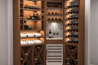
And just like that, two small walls of cabinetry expanded to four walls of spacious storage! For wine and stemware storage we added two glass cabinets that flanked the patio doors, looking into the backyard from the formal dining room.
When we presented the design concept to Kristen and Tim, they said they really loved it! There were a couple of tweaks here and there, but with the design concept created, the next step was for the Install team to do a pre-construction walk and establish the scope of work.
Scope of construction work: Full remodel
We chose to do a full kitchen remodel, keeping a similar layout. Here, the construction and installation were provided by B+K. It included:
- Removing part of a wall to extend kitchen space
- Removing and replacing a window
- Removing and replacing only the kitchen floor
Selecting cabinetry, fittings, and fixtures
After carefully-considering Kristen and Tim’s goals and budget, as well as the latest trends, here’s what we went for in the kitchen:
a. Cabinetry: Dura Supreme Bria Parker Paintable White furniture board with grain interior
Keeping in mind that increasing the storage space and functionality of the kitchen were important factors, we chose to go with Dura Supreme’s Bria cabinetry. Aside from how beautiful they are, we chose them because their frameless construction optimizes for full access to the interior and storage.
These cabinets are semi-custom to custom, offering design flexibility. They provide a “solution to every storage problem”.
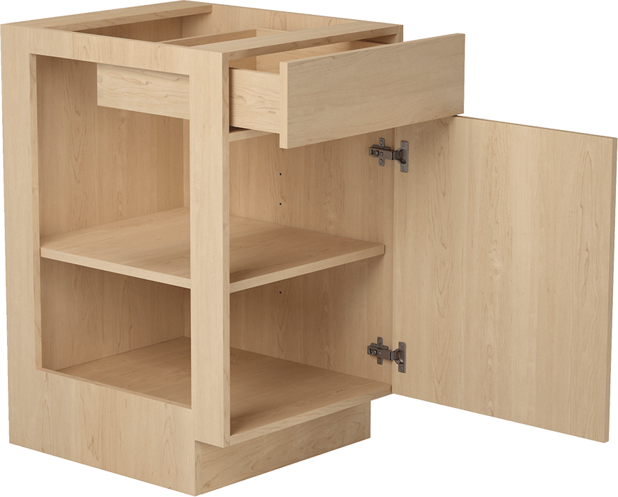
Bria’s frameless, full-access construction
b. Countertop and backsplash: Silestone Ethereal Dusk
Ethereal Dusk is one of the most urban and modern designs in this Silestone collection. These countertops have a bluish tone in the interior of each of its veins that gives it a modern touch, in combination with its “avant-garde geometric directionality”.
c. Other details we changed to complete the upgrade:
- Window: White – clear glass
- Sink: KH-3318-S Handmade Stainless Steel Kitchen Sink
- Faucet: Pull-Down Faucet with Arc Spout and Knurled Handle
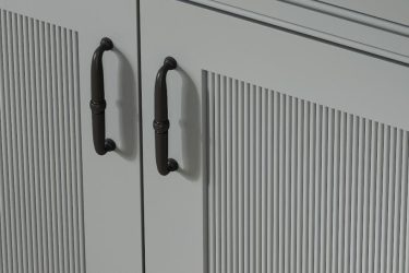
- Hardware: Top Knobs – Ascendra – Pull
- Lights: Recessed LED Lighting, 5/6 Inch, Baffle, Damp Rated, 1050 LM – 3000k
- Paint: Sherwin-Williams
Note: Some items shown are not included in the price, such as appliances; these are purchased by the client and then installed by B+K.
Finalizing this design was an exciting challenge and a rewarding experience. B+K’s Kat says, “I really enjoyed working with Kristen and Tim. There is a sense of joy I feel when a client is so happy with the kitchen design, there isn’t another feeling like it.”
Final verdict: What did the clients say?
“I love the design and can’t wait to get started!”
And that’s exactly what we hoped Kristen and Tim would say.
In addition to great quality and a smooth experience, what you get with B+K is well-thought-out design that factors in all your unique requirements, solves problems in creative ways, and leads to beautiful, inviting spaces that you and your family will love for years.
Through in-depth surveys and discussions, we take the guesswork out of your remodel and help you identify and achieve exactly what you want. Before we introduce you to our ideas, our team of designers will work to understand your goals and vision, ensuring that everything we suggest is in line with what you want.
Kristen and Tim decided to remodel because their existing kitchen wasn’t working for them. Is there something about your kitchen that feels restrictive or not quite right? Talk to us about it! Our team will help you find the perfect design and finish for your individual preferences.
